Ikigai
A small-batch Montreal kombucha where every flavour was named for a city, built by three Concordia students.
Kombucha is treated as an occasional treat, bought for the fizz and a vague promise of probiotics. Montreal had plenty on the shelf but little that was genuinely health-driven, and nothing that felt personal to the people drinking it. Meanwhile, grocers were throwing out produce that was perfectly good to brew with.
- 01
Started in October 2022 as a pitch between two roommates, Maximilian Krylov and me, brewing small batches in our downtown apartment under the working name Ikigaive.
- 02
Settled on a week-and-a-half cycle: a 6 to 10 day first fermentation, bottling with the flavour ingredients, then a 3 to 10 day second fermentation for carbonation.
- 03
Launched with Montreal Maple, then grew the idea into a line where each flavour took a city as its theme, from California Coastline to Manila Mango, Mumbai Chai, and Shiraz Saffron.
- 04
Kept the branding homemade as Hugo Agnola joined: a hand-drawn logo and labels we designed ourselves, learning most of it as we went.
- 05
Joined District 3, Concordia's innovation hub, as a hosted startup in January 2024, and ran ten conversations with grocers, co-ops, and other founders that pushed the recipe toward upcycling local produce that would otherwise be wasted.
Ikigai ended with real bottles, a finished brand, and a clear-eyed read on consumer packaged goods. The category rewards scale, and production and distribution, not the product, became the ceiling. Bootstrapping a beverage supply chain alongside full-time studies was not a fight worth forcing, so we brought it to a close, and kept the lessons on margins, logistics, and brand-before-product that shaped everything after.
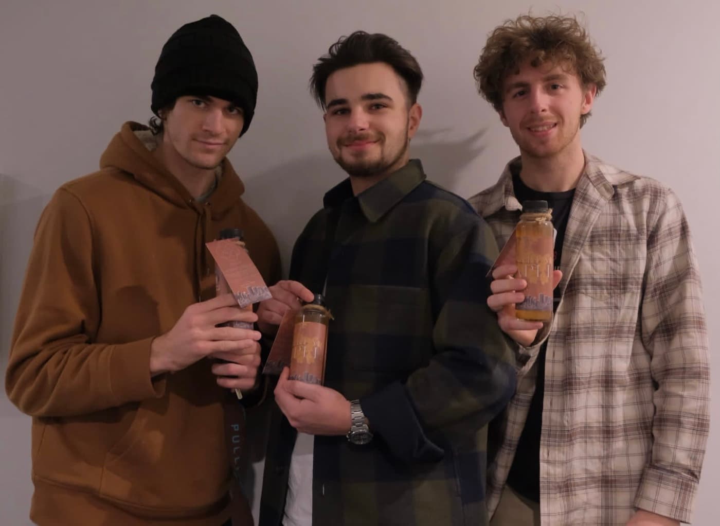
Three founders, first bottles
Maximilian, Hugo, and me with an early run. Every step, from brewing and bottling to cutting labels, happened between classes in an apartment kitchen, which was the charm of it and, eventually, the limit.
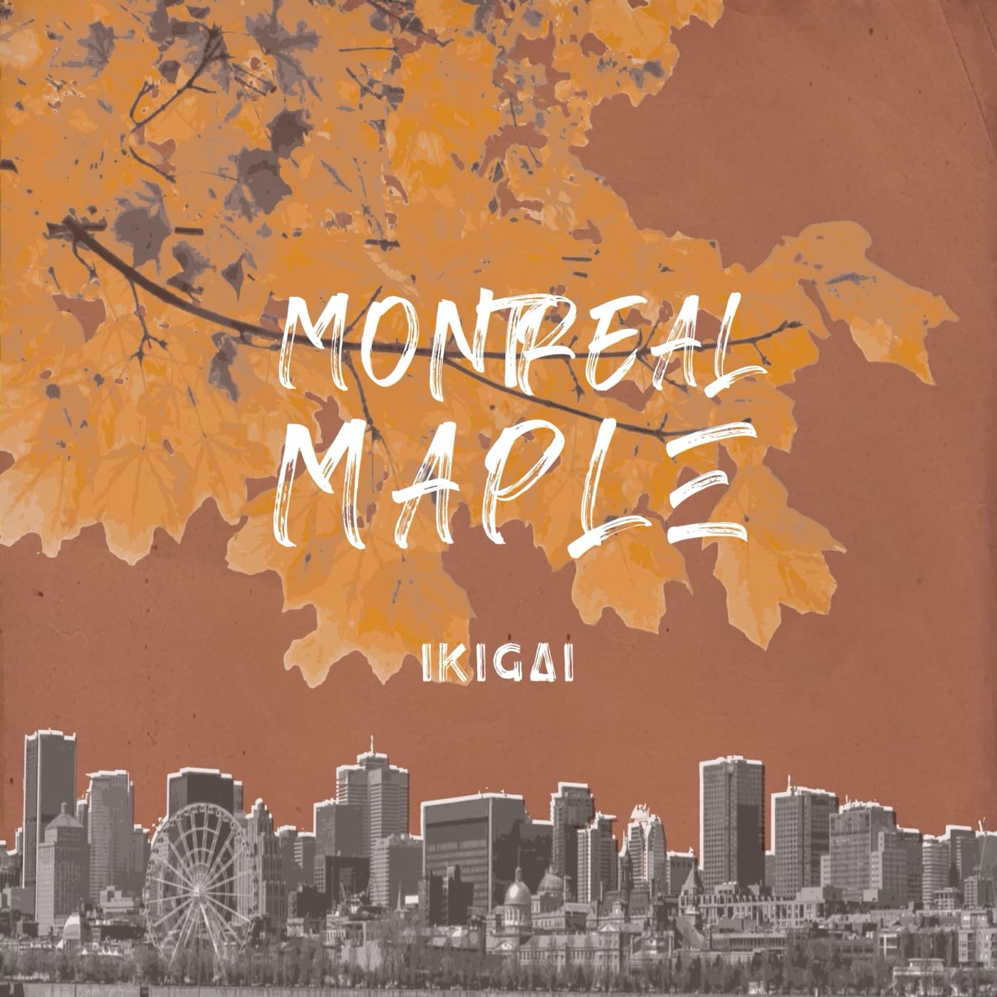
Montreal Maple, the first flavour
The first flavour set the template for the rest: a place, an ingredient it is known for, and a label that reads like a postcard. Autumn maple hangs over the skyline, and the Ikigai name sits quietly underneath, so the city does the talking.
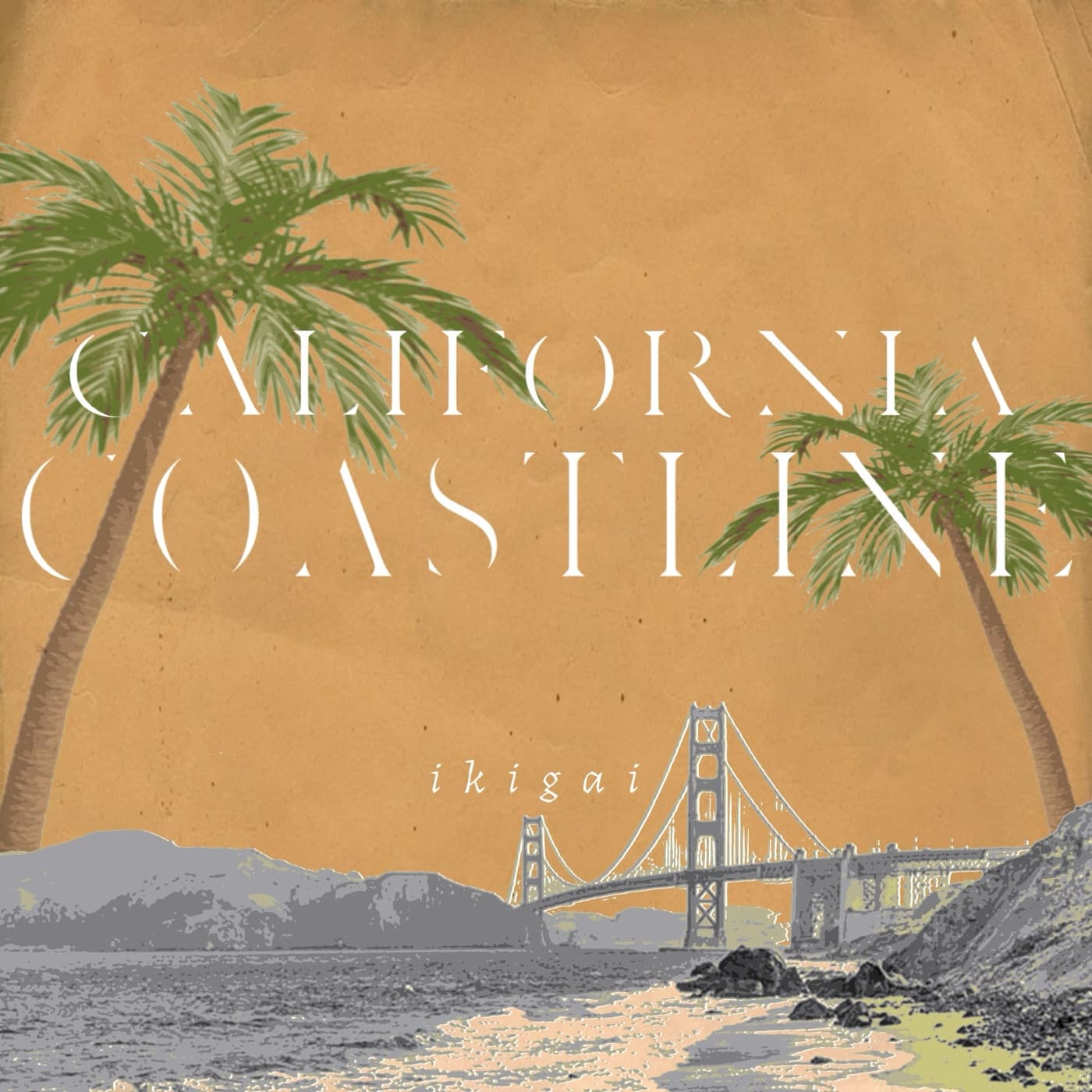
A shelf of cities
California Coastline carried the same system to the Golden Gate. The plan was a row of cities on the shelf, Manila Mango, Mumbai Chai, Shiraz Saffron, each one a small lesson in where its ingredients come from.
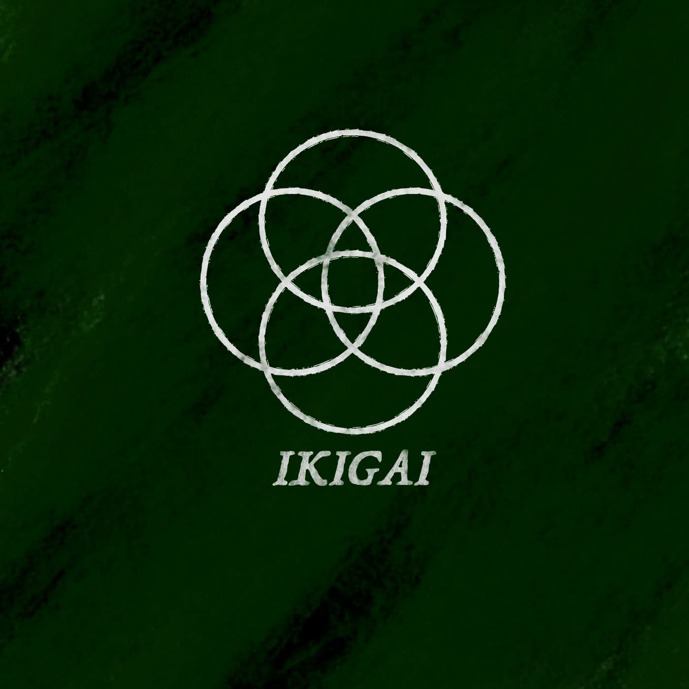
Four circles, one centre
Ikigai is usually drawn as four overlapping circles: what you love, what you are good at, what the world needs, and what you can be paid for. The mark keeps that structure but draws it by hand, so it reads as something made at a kitchen counter rather than in a boardroom.